A web console for managing a fleet of gateway devices at scale - inventory, fine-grained access, over-the-air updates and backups - all organized around a single idea: the Group. I owned the product design end-to-end.
The people running this fleet are internal - the same employees who sell the company's own hardware and handle its support. Before this panel, almost every operation was done without any admin UI at all: directly against the API. The company decided to build a proper console to make those daily operations manageable.
The difficulty was never a missing feature - the API could already do everything. It was the gap between an enormous, unforgiving domain - fleets of devices, fine-grained permissions, over-the-air updates, rollbacks - and the people expected to operate it: sales and support staff who need to move fast and, above all, not break a device in the field.
Registering a gateway, granting access, pushing a firmware release, restoring a backup - each was a hand-assembled request. Correct only if you already knew the payload. No shared view of what state anything was in, and no margin for a typo when the target is physical hardware.
The same operations become named actions on screen - with the state of every device visible, the risky ones guarded, and one consistent pattern across all eight modules. Fast for the common case, legible when something goes wrong.
I was the only designer on the project and owned Product Design end-to-end - from information architecture and flows to the final screens. The interface was built on top of the company's existing corporate visual style: a light, functional system with a light-gray sidebar, a white workspace, an orange primary action and the bold Fleet management wordmark. My job was to make that restrained, utilitarian brand carry a genuinely complex operational tool.
Before drawing screens I mapped the whole system. Everything the operator touches - devices, permissions, releases, deployments, backups - resolves to one shared concept: the Group. The API is group-centric, so the interface is too.
Devices are grouped. Permissions, releases and rollouts all attach to a group. Learn where the Group sits in one screen and the same handle appears in every other.
Find any device by keyword, group or date - with its state and every routine action right there in the list.
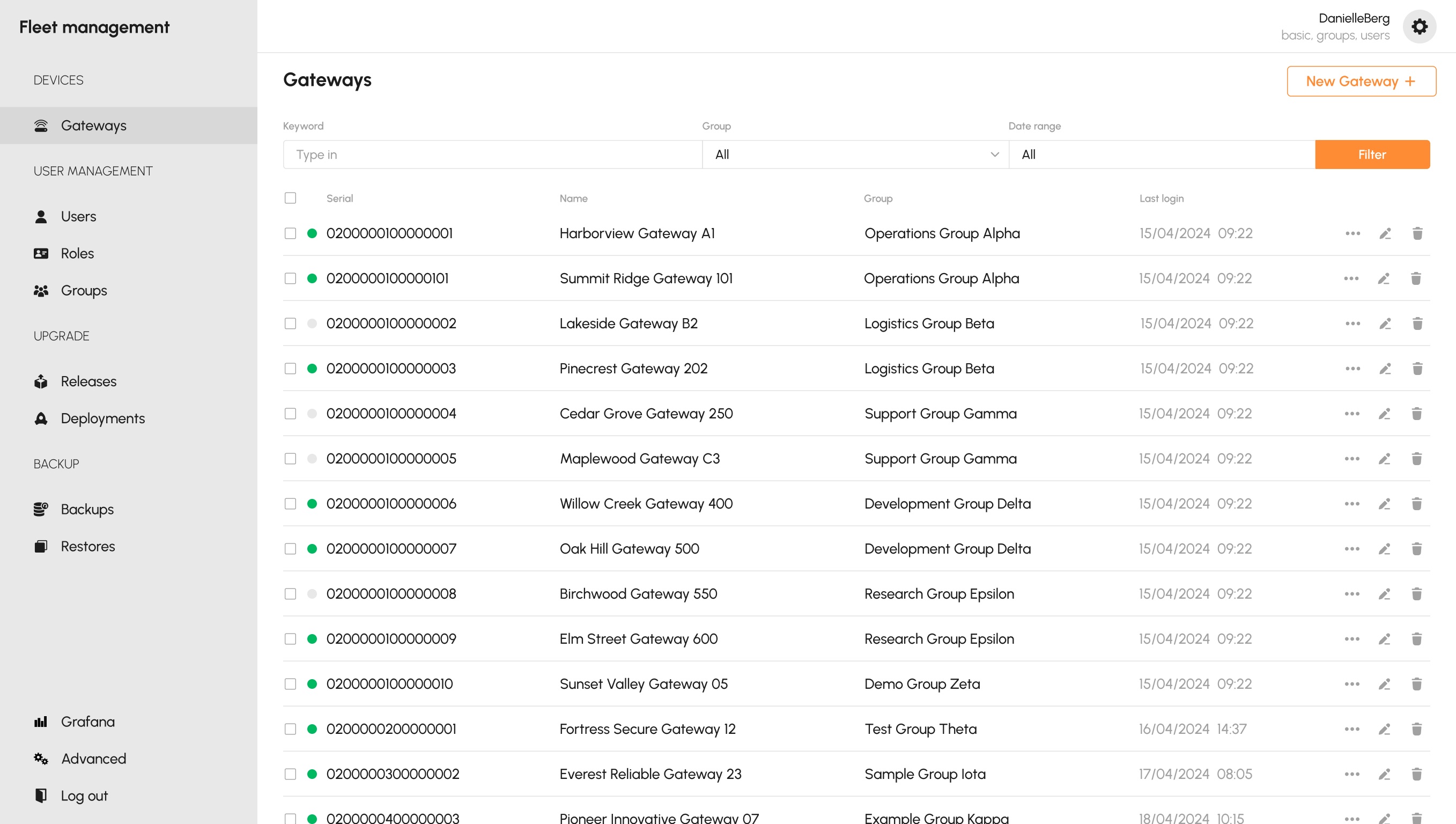
The Gateways table is the front door: serial, friendly name, group and last login, with a live connection dot and per-row actions. The same Keyword / Group / Date filter bar that appears on every other screen sits at the top - so the fleet reads at a glance and every routine action lives on the row itself.
Keyword, Group and Date range - the exact same control the operator meets on Users, Releases, Deployments and Backups.
A green / grey dot per row shows connection state before you read a single word.
Every device carries its group inline - the organizing unit is visible, not buried in a detail view.
Edit, delete and more sit on the row itself - no drill-down for routine work.
 1
2
3
4
1
2
3
4
Roles map one-to-one to what a device can actually do. Nobody has to reason about a permission matrix.
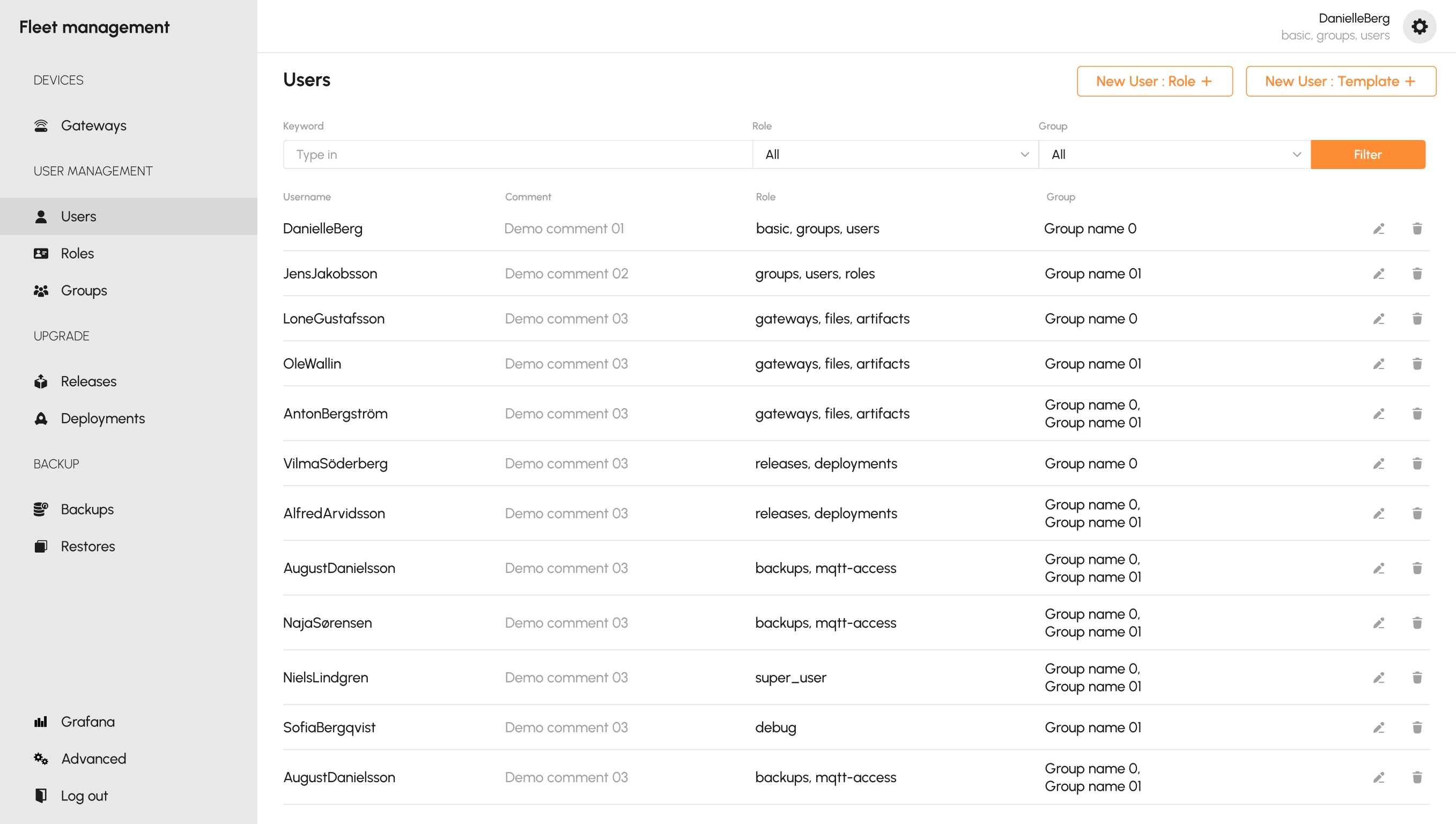
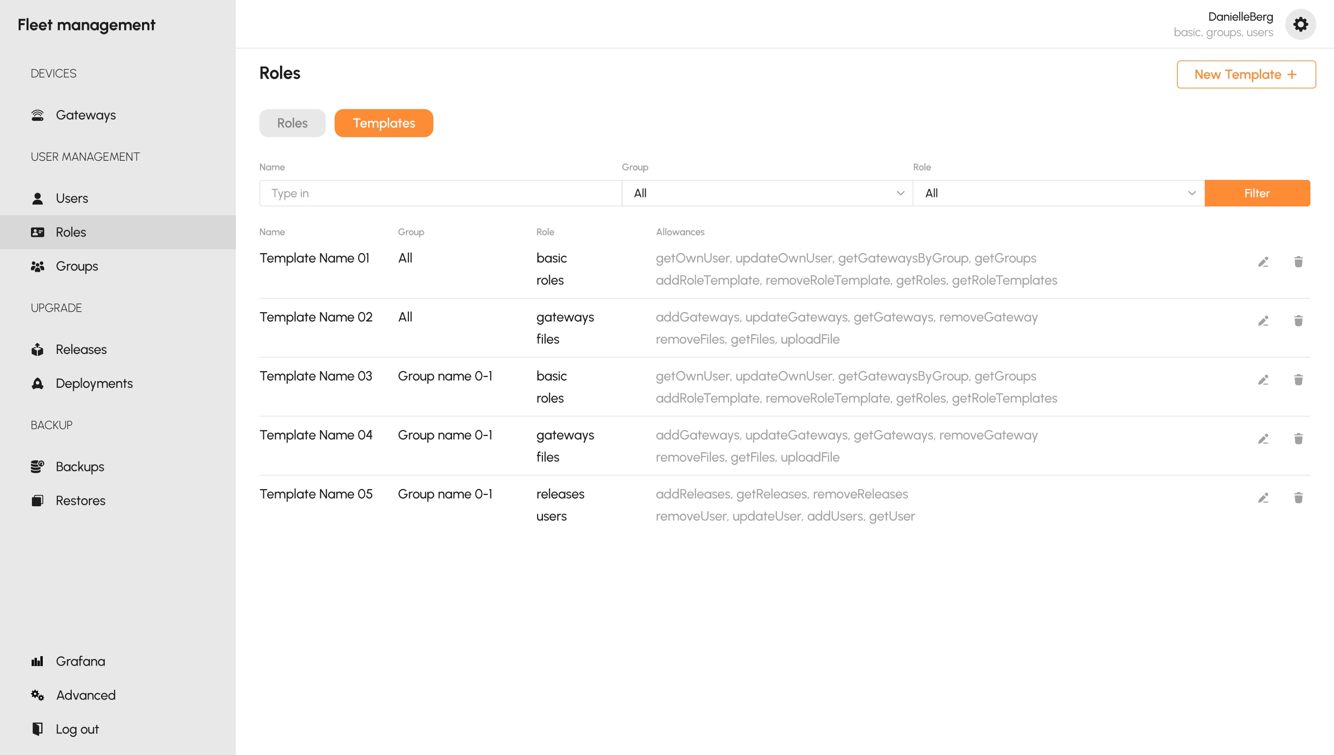
Access is built from three primitives: Users, Roles and hierarchical Groups. Each role maps 1:1 to a feature scope - gateways, files, artifacts, releases, deployments, backups, mqtt-access, super_user, debug - so a user's power reads as a plain list of capabilities, not a grid of checkboxes.
New User: Role for precise, one-off control; New User: Template for a pre-bundled set - both live at the top-right.
A user's role reads as gateways, files, artifacts - the scopes they hold, in plain language.
Access is always bounded by group, so the same role means different reach for different operators.
Each template spells out the exact API allowances it grants - the fine print stays visible, not hidden.
 1
2
3
1
2
3
 4
4
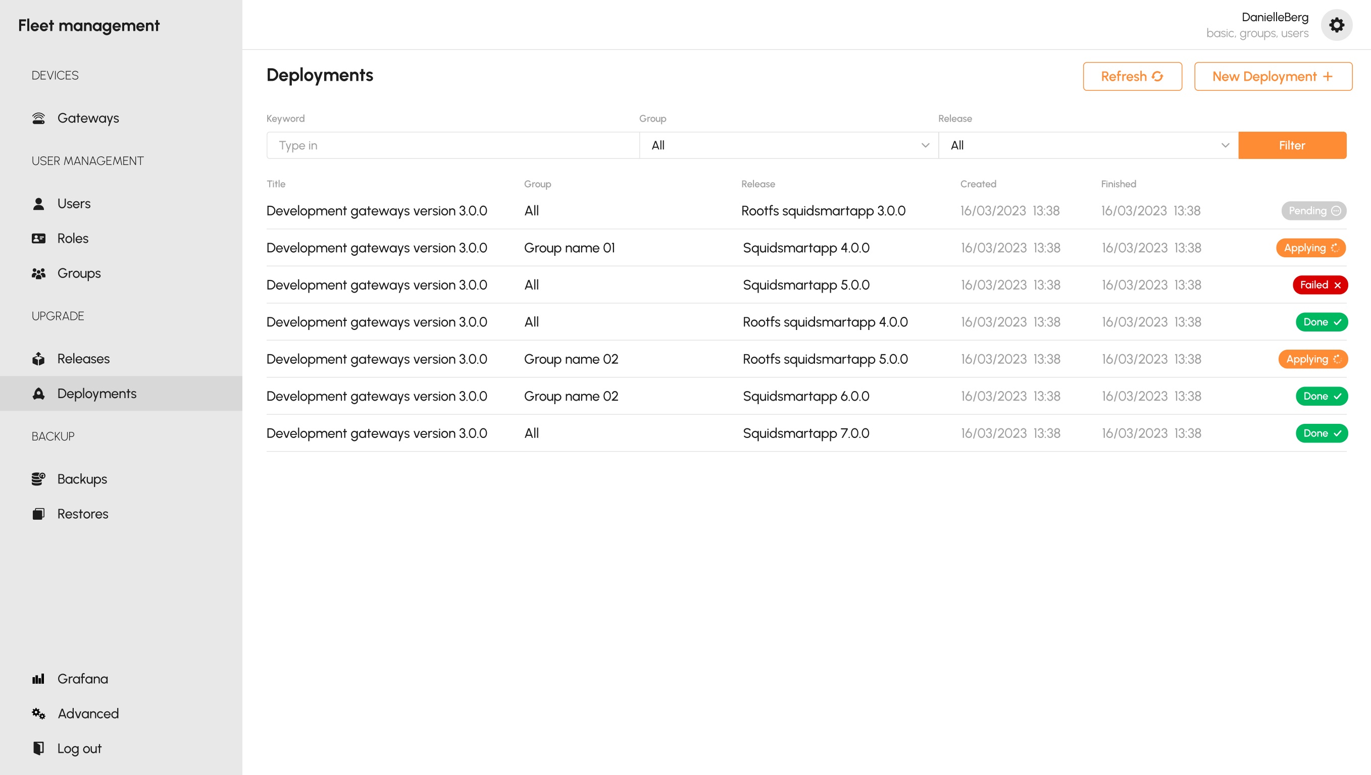
A release is defined once; a deployment applies it to a group - and every device reports where it stands.
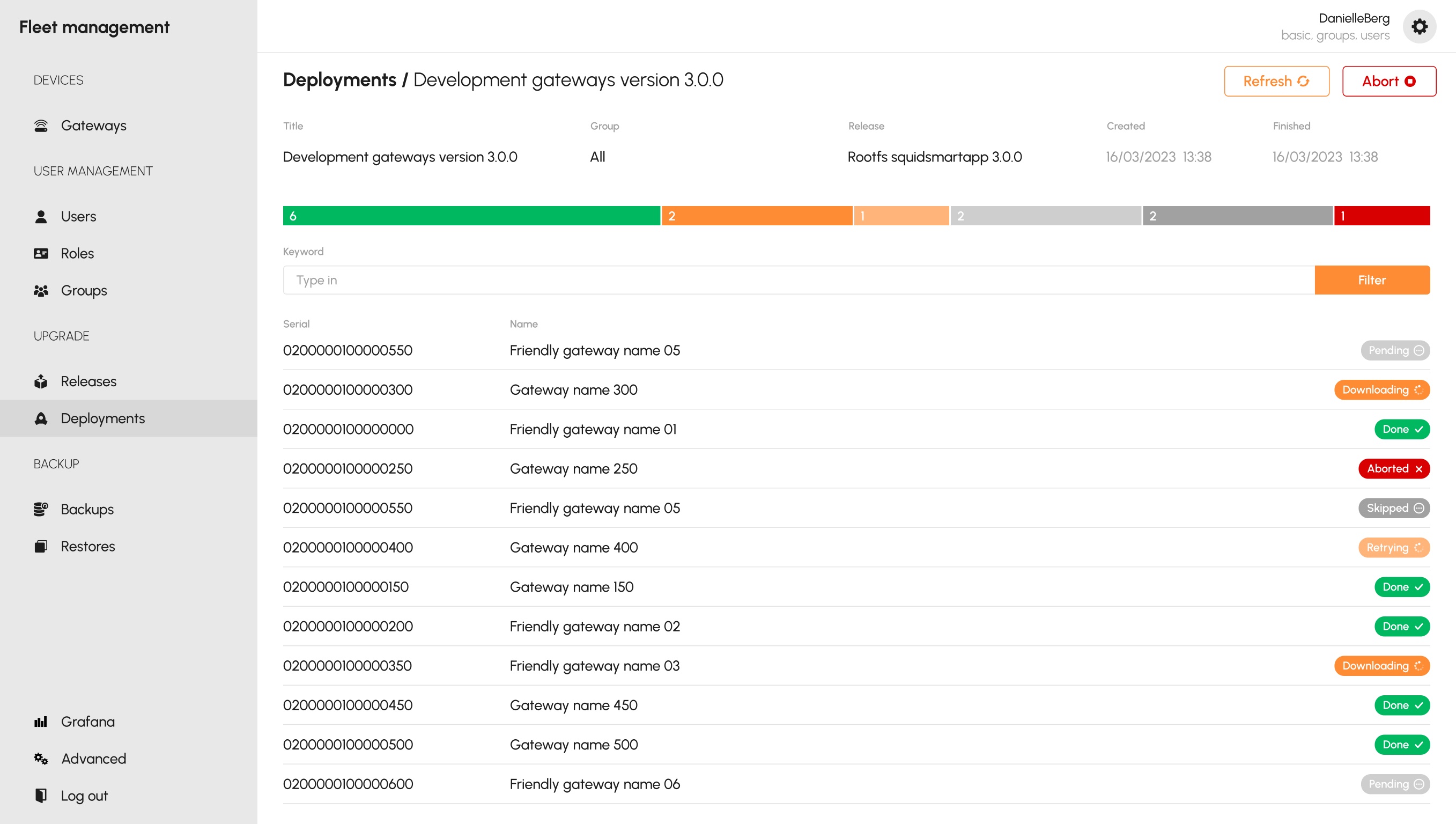
A Release bundles a version and its artifacts, scoped to a group. A Deployment applies that release to a group and then tracks it live: the run moves Pending → Applying → Done or Failed, per device, with a Refresh control to poll progress. This is a physical over-the-air update - so the interface treats its state as the main event, not an afterthought.
Every deployment ends in an explicit badge: Pending Done Failed.
Each deployment names the group it targets and the release it carries - the same two handles, every time.
Long-running rollouts don't block the operator; a Refresh pulls the latest state on demand.
Open a deployment and every gateway reports its own state - with a summary bar up top that totals the whole run at a glance.
 1
2
3
4
1
2
3
4
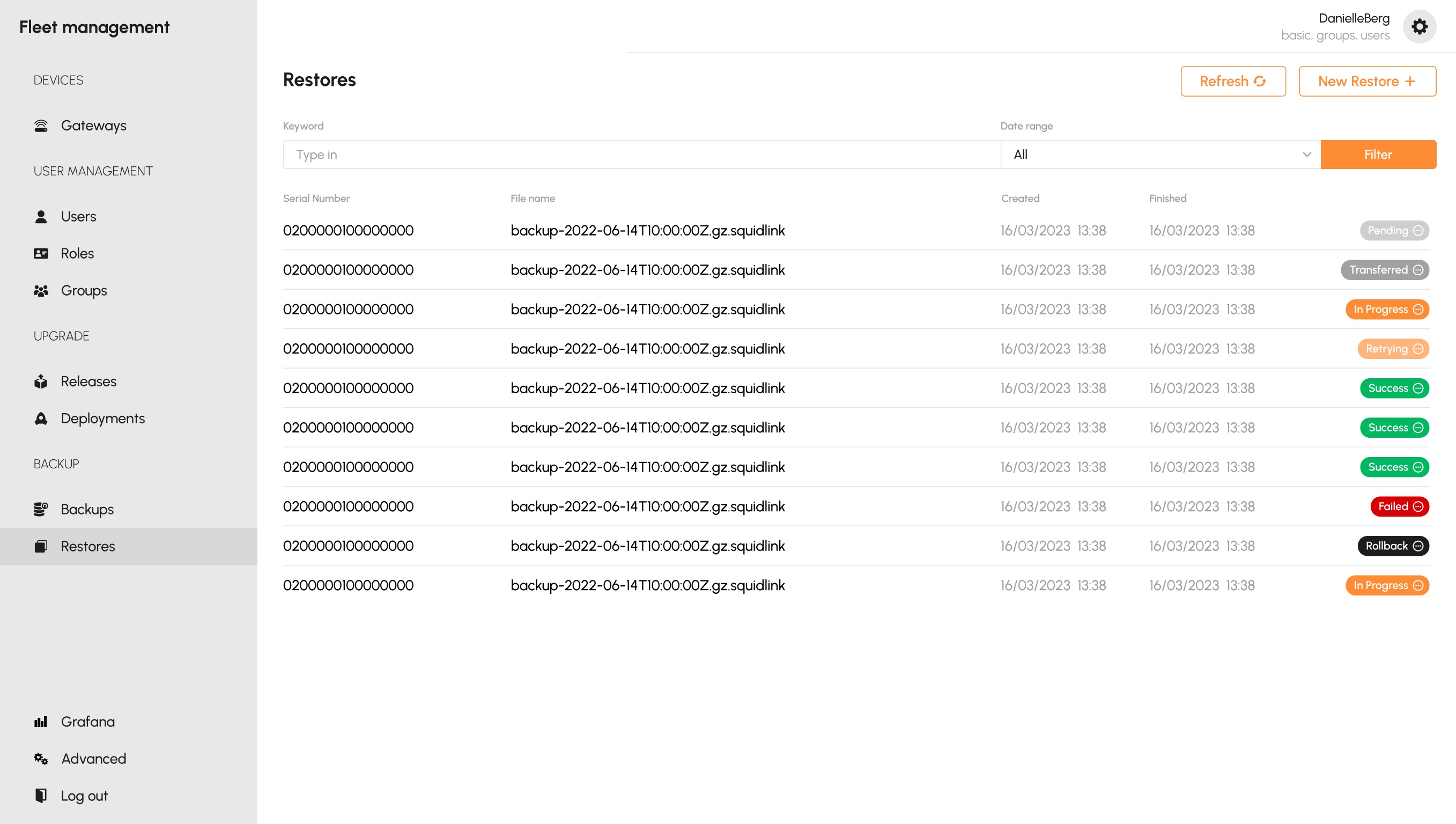
A restore can fail safely - and when it does, the operator sees the rollback happen.
Devices are backed up per group, and a Restore replays a backup file onto a gateway. Because it writes to live hardware, a restore carries the richest status vocabulary in the product: Pending, Transferred, In Progress, Retrying, Success, Failed - and Rollback. That last badge is the point: a failed restore that recovered safely looks different from one that simply failed.
The full lifecycle is legible at a glance: Transferred In Progress Success.
Failed and Rollback are distinct - the operator knows whether the device recovered.
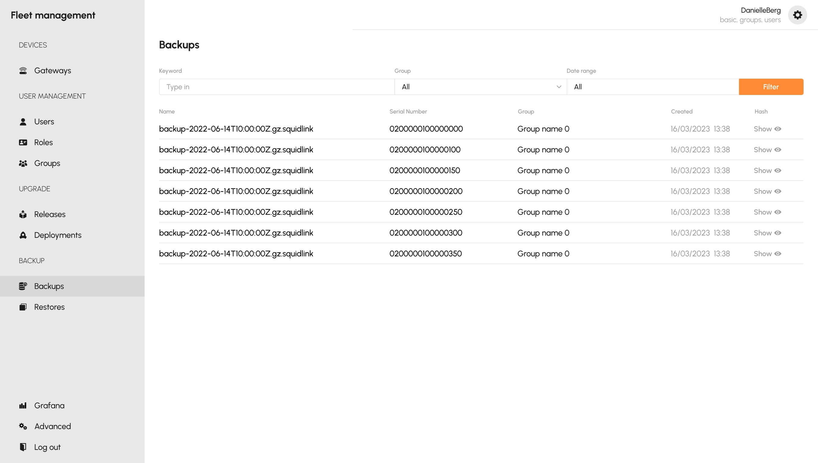
Each backup lists its serial, group, timestamp and a hash to verify - the source a restore draws from.
 1
2
1
2
 3
3
The group-centric model and the single screen skeleton read as inevitable now - but the first drafts weren't. I mapped the whole API, tried the wrong things first, and reshaped each screen against feedback from the employees who actually run it.
On screen-shares and over-the-shoulder reviews, a single dot forced people to hover or ask. I moved to explicit text badges and split Failed from Rollback, so a device that recovered never reads as broken.
The first cut mirrored the API's raw scopes as a matrix. Support staff read it as coordinates, not capability. Roles now map 1:1 to a scope and render as plain words - gateways, files, artifacts.
Early screens invented per-module layouts and labels. Consolidating onto one skeleton - title, primary action top-right, the same Group / Keyword / Date filter bar - meant learning one screen taught all eight.
Every screen above was walked through with the employees who run that exact functionality. The decisions on the next section are what survived that feedback - not what I assumed going in.
The design was validation-driven. Every screen was walked through with the company employees who run that exact functionality, so each decision below was shaped by continuous feedback from the actual users of that feature - not a designer's assumption about them.
For actions that touch physical hardware and can fail - Deployments and Restores - every state is surfaced as an explicit badge in the table, with a Refresh control to poll live progress. When a bad update can brick a customer's device, an operator needs to see exactly where an operation stands, and whether it rolled back safely, rather than decode an opaque API response. Visibility is what gives them the confidence to act fast.
Devices, permissions, releases and deployments all scope to Group, and every list screen carries the same filter bar and the same layout skeleton - title, primary action top-right, filters, table. The underlying API is group-centric, so mirroring that one model everywhere - instead of inventing per-module concepts - means once an operator learns one screen, they know them all. Consistency turns an eight-module system into one learnable pattern.
Creating a user offers two doors: by Role and by Template. Support staff onboard people constantly, so the Template path encodes common permission bundles for speed, while the by-Role path stays available for precise, one-off control. Fast by default, granular when needed.
The honest outcome is a shift in kind, not a number. The team moved from wrangling the fleet through raw, manual API calls to operating it in a dedicated admin panel - and everyday work got dramatically faster and easier because of it.
Registering a device, granting access, pushing a release or restoring a backup are now the same shaped action every time - not a payload reconstructed from memory.
Anyone on the team can see where an operation stands and whether it rolled back safely, instead of that knowledge living in one person's terminal history.
One filter bar and one screen skeleton across eight modules means new support staff get productive on the whole panel by learning one part of it.
No formal metrics were captured for this project, so none are claimed here - the change is described as the team experienced it.
When the API can already do everything, design is not about capability - it's about legibility and safety. The most valuable move was refusing to invent per-module concepts and instead mirroring the one model the system already ran on. Consistency did more for usability than any single clever screen.
Bulk actions across a filtered set of devices; saved filter views for the operations a team repeats daily; a deeper tie between Deployments and Grafana so a rollout's health is visible in the same place it's triggered; and an audit trail, so the shared state extends backwards in time, not just to right now.
I design complex, rule-heavy products end-to-end - from information architecture to the last empty state.